HTML 양식의 form은 CSS를 통해 크게 향상될 수 있다:
input field 스타일링
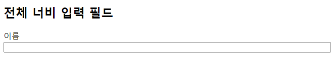
width 속성을 사용하여 입력 필드의 너비를 결정한다:
| <!DOCTYPE html> <html> <head> <style> input { width: 100%; } </style> </head> <body> <h2>전체 너비 입력 필드</h2> <form> <label for="fname">이름</label> <input type="text" id="fname" name="fname"> </form> </body> </html> |
input 요소에 width 100%로 창 크기 100%로 설정하였고, 아래 그림과 같다.
위의 예는 모든 <input> 요소에 적용된다. 특정 입력 유형만 스타일을 지정하려면 속성 선택자를 사용할 수 있다:
input[type=text] - 텍스트 필드만 선택한다
input[type=password] - 암호 필드만 선택한다
input [type=number] - 숫자 필드만 선택한다
등등..
CSS Padded Input
padding 속성을 사용하여 텍스트 필드 내부에 공간을 추가한다.
팁: 여러 개의 입력이 있을 경우 여유를 추가하여 입력 외부에 공간을 더 많이 추가할 수도 있다:
| <!DOCTYPE html> <html> <head> <style> input[type=text] { width: 100%; padding: 12px 20px; margin: 8px 0; box-sizing: border-box; } </style> </head> <body> <h2>Padded 입력 필드</h2> <form> <label for="fname">이름</label> <input type="text" id="fname" name="fname"> <label for="lname">성</label> <input type="text" id="lname" name="lname"> </form> </body> </html> |
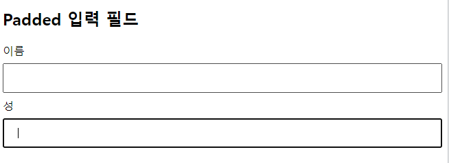
inputp[type=text] 인 경우, width 100%, padding 12px, 20px, margin 8px 0, box-sizing border-box로 설정하였고, 아래 그림과 같이 표시된다.
box-sizing 속성을 border-box 로 설정했다. 이렇게 하면 패딩과 테두리가 요소의 전체 너비와 높이에 포함된다.
CSS 입력양식 테두리
border 속성을 사용하여 테두리 크기와 색상을 변경하고 border-radius 속성을 사용하여 둥근 모서리를 추가한다:
| <!DOCTYPE html> <html> <head> <style> input[type=text] { width: 100%; padding: 12px 20px; margin: 8px 0; box-sizing: border-box; border: 2px solid red; border-radius: 4px; } </style> </head> <body> <h2>입력 양식 테두리</h2> <form> <label for="fname">이름</label> <input type="text" id="fname" name="fname"> <label for="lname">성</label> <input type="text" id="lname" name="lname"> </form> </body> </html> |
input 요소에 type=text 정의에 border 2px solid red, border-radius 4px를 설정하였고, 위의 코드를 실행한 결과는 아래 그림과 같다.

만일 하단 테두리만 사용하려면 border-bottom 속성을 사용합니다:
| <!DOCTYPE html> <html> <head> <style> input[type=text] { width: 100%; padding: 12px 20px; margin: 8px 0; box-sizing: border-box; border: none; border-bottom: 2px solid red; } </style> </head> <body> <h2>하단 테두리만 설정한 입력양식</h2> <form> <label for="fname">이름</label> <input type="text" id="fname" name="fname"> <label for="lname">성</label> <input type="text" id="lname" name="lname"> </form> </body> </html> |
border-bottom 속성에

CSS Colored Input Forms
background-color 속성을 사용하여 입력에 배경색을 추가하고, color 속성을 사용하여 텍스트 색을 변경한다:
| <!DOCTYPE html> <html> <head> <style> input[type=text] { width: 100%; padding: 12px 20px; margin: 8px 0; box-sizing: border-box; border: none; background-color: #3CBC8D; color: white; } </style> </head> <body> <h2>Input fields with color</h2> <form> <label for="fname">이름</label> <input type="text" id="fname" name="fname" value="길동"> <label for="lname">성</label> <input type="text" id="lname" name="lname" value="홍"> </form> </body> </html> |
CSS에서 colored input 스타일을 설정하는 배경색은 background-color속성에 #3CBC8D값을, 텍스트색상은 color에 white를 설정하였고, 위의 코드를 실행한 결과는 아래 그림과 같다.

CSS focused inputs
기본적으로 일부 브라우저는 입력이 포커스를 맞출 때(클릭) 입력 주위에 파란색 윤곽선을 추가한다. outline:none; 입력에 추가하여 이 동작을 제거할 수 있다.
:focus 선택자를 사용하여 포커스가 설정될 때 입력 필드로 작업을 수행한다:
| <style> input[type=text] { width: 100%; padding: 12px 20px; margin: 8px 0; box-sizing: border-box; border: 1px solid #555; outline: none; } input[type=text]:focus { background-color: lightblue; } </style> </head> <body> <h2>Input fields with color on :focus</h2> <p>여기서 입력 필드는 포커스를 맞출 때 색상을 얻습니다(클릭):</p> <form> <label for="fname">이름</label> <input type="text" id="fname" name="fname" value="길동"> <label for="lname">성</label> <input type="text" id="lname" name="lname" value="홍"> </form> </body> </html> |
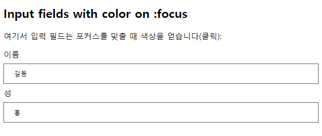
input filed에 :focus 상태일 때, background-color lightblue 색상으로 설정하도록 정의하였고, 아래 그림은 초기 상태의 그림이다.(포커스 전)
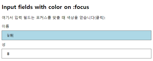
이름 input 양식에 클릭하면 아래 그림과 같이 background-color lightblue색상으로 설정이 된다.
아래 예제는 input filed에 focus 상태일 때, 테두리 색상을 스타일하는 예제이다.
| <!DOCTYPE html> <html> <head> <style> input[type=text] { width: 100%; padding: 12px 20px; margin: 8px 0; box-sizing: border-box; border: 3px solid #ccc; -webkit-transition: 0.5s; transition: 0.5s; outline: none; } input[type=text]:focus { border: 3px solid #555; } </style> </head> <body> <h2>Input fields with black border on :focus</h2> <p>여기서 입력 필드는 포커스를 맞출 때 검은색 테두리 색상을 얻습니다(클릭). 테두리 색상을 애니메이션하기 위해 CSS 전환 속성도 추가했습니다(포커스 색상 변경에 0.5초 소요):</p> <form> <label for="fname">이름</label> <input type="text" id="fname" name="fname" value="길동"> <label for="lname">성</label> <input type="text" id="lname" name="lname" value="홍"> </form> </body> </html> |
input 요소에 focus상태인 경우, border 3px solid #555 스타일로 지정하며, 위의 코드를 실행한 결과 화면은 아래 그림과 같다.

focus가 된 상태의 그림은 아래와 같다.

CSS input with icon/image
입력 내부에 아이콘을 입력하려면 배경 이미지 속성을 사용하여 배경 위치 속성과 함께 배치한다. 또한 아이콘의 공간을 예약하기 위해 왼쪽에 큰 패딩을 추가한다:
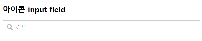
| <!DOCTYPE html> <html> <head> <style> input[type=text] { width: 100%; box-sizing: border-box; border: 2px solid #ccc; border-radius: 4px; font-size: 16px; background-color: white; background-image: url('searchicon.png'); background-position: 10px 10px; background-repeat: no-repeat; padding: 12px 20px 12px 40px; } </style> </head> <body> <h2>아이콘 input field</h2> <form> <input type="text" name="search" placeholder="검색.."> </form> </body> </html> |
CSS에 input 요소 스타일을 background-image (url(searchicon.png'), background-position 10px 10px background-repeat no-repeat, padding 12px 20px 12px40px로 스타일을 정의하였고, 실행한 결과는 아래 그림과 같다.
CSS animated search input
이 예에서는 CSS transition 속성을 사용하여 검색 입력이 포커스가 될 때 검색 입력의 너비를 애니메이션화한다
| <!DOCTYPE html> <html> <head> <style> input[type=text] { width: 130px; box-sizing: border-box; border: 2px solid #ccc; border-radius: 4px; font-size: 16px; background-color: white; background-image: url('searchicon.png'); background-position: 10px 10px; background-repeat: no-repeat; padding: 12px 20px 12px 40px; transition: width 0.4s ease-in-out; } input[type=text]:focus { width: 100%; } </style> </head> <body> <h2>Animate width of search input</h2> <form> <input type="text" name="search" placeholder="Search.."> </form> </body> </html> |
CSS input 요소에 transition width 0.4s ease-in-out으로 설정하면 너비를 창크기만큼 0.4sec안에 애니메이션 전환 효과를 준다. 위의 코드를 실행한 그림은 아래와 같다.

input요소에 focus 상태일 경우 너비를 100% 스타일을 지정하였으며 아래 그림과 같이 애니메이션되어 늘어난다.

지금까지 다양한 Form에 대해 CSS에서 스타일을 실습해 보았다.
가장 흔하게 사용하는 input 요소, textarea 요소, select menu, input button 그리고 responsive form에 대한 실습을 살펴보았다.
꼭 손으로 눈으로 머리로 익히며 실습하기를 바란다.
모두 화이팅입니다.!!!
출처 : 이 글의 출처는 w3schools사이트를 참고하였으며 필자가 추가하여 정리한 글입니다.
'HTML > CSS문법' 카테고리의 다른 글
| CSS Website Layout (0) | 2023.09.09 |
|---|---|
| CSS textarea, select menu, input button etc (0) | 2023.09.08 |
| CSS Attribute Selector(속성 선택자) (0) | 2023.09.06 |
| CSS image sprites (0) | 2023.09.05 |
| CSS image gallery (3) | 2023.09.04 |


댓글