CSS Website Layout
웹 사이트는 종종 머리글, 메뉴, 내용 및 바닥글로 나뉜다:
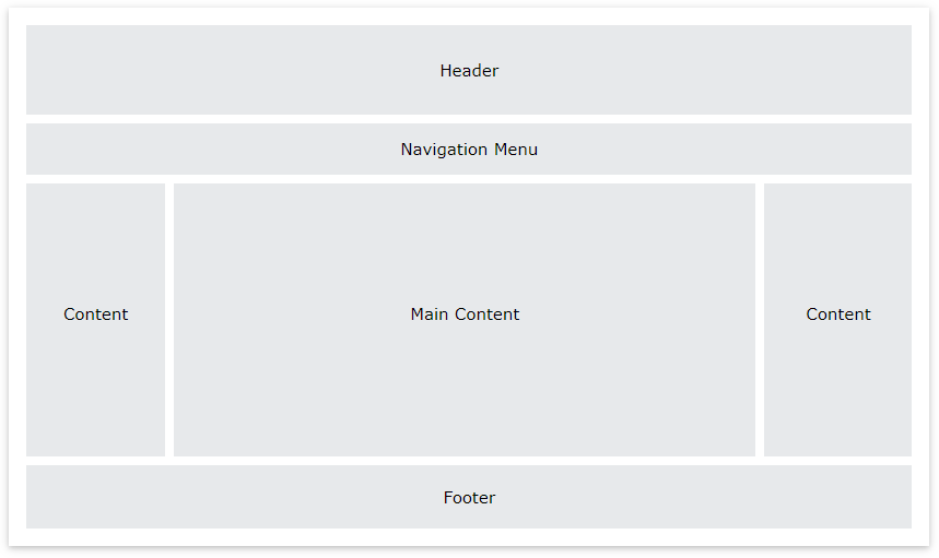
선택할 수 있는 다양한 레이아웃 설계가 있다. 그러나 위의 구조는 가장 일반적인 구조 중 하나이며, 이 튜토리얼에서 자세히 살펴보겠다.
Header
헤더는 일반적으로 웹 사이트의 상단(또는 상단 탐색 메뉴 바로 아래)에 있다. 여기에는 로고 또는 웹 사이트 이름이 포함되는 경우가 많다:
| <!DOCTYPE html> <html lang="en"> <head> <title>CSS Website Layout</title> <meta charset="utf-8"> <meta name="viewport" content="width=device-width, initial-scale=1"> <style> body { margin: 0; } /* Style the header */ .header { background-color: #f1f1f1; padding: 20px; text-align: center; } </style> </head> <body> <div class="header"> <h1>Header</h1> </div> </body> </html> |
header 스타일은 background-color #f1f1f1, padding 20px, text-align center 로 스타일을 지정하였고, 위의 코드를 실행한 결과는 아래 그림과 같다.

CSS Navigation Bar
탐색 모음에는 웹 사이트를 탐색하는 방문자에게 도움이 되는 링크 목록이 포함되어 있습니다:
| <!DOCTYPE html> <html lang="en"> <head> <title>CSS Website Layout</title> <meta charset="utf-8"> <meta name="viewport" content="width=device-width, initial-scale=1"> <style> * { box-sizing: border-box; } body { margin: 0; } /* Style the header */ .header { background-color: #f1f1f1; padding: 20px; text-align: center; } /* Style the top navigation bar */ .topnav { overflow: hidden; background-color: #333; } /* Style the topnav links */ .topnav a { float: left; display: block; color: #f2f2f2; text-align: center; padding: 14px 16px; text-decoration: none; } /* Change color on hover */ .topnav a:hover { background-color: #ddd; color: black; } </style> </head> <body> <div class="header"> <h1>Header</h1> </div> <div class="topnav"> <a href="#">홈</a> <a href="#">뉴스</a> <a href="#">연락처</a> </div> </body> </html> |
topnav 네비게이션 바 클래스는 overflow hidden, background-color #333 으로 스타일을 지정하였고,
topnav a 링크는 float left, display block, color #f2f2f2 text-align center, padding 14px 16px, text-decoration none으로 지정하였다.
topnav hover상태 클래스는 background-cloor #ddd, color black으로 스타일을 지정하였으며 위의 코드를 실행한 결과는 아래 그림과 같다.

Content
이 섹션의 레이아웃은 종종 대상 사용자에 따라 다르다. 가장 일반적인 레이아웃은 다음 중 하나이다:
- 1-column(모바일 브라우저에 자주 사용됨)
- 2-column(태블릿 및 노트북에 자주 사용됨)
- 3-column 레이아웃(데스크탑에만 사용)

3열 레이아웃을 만들고, 작은 화면에서 1열 레이아웃으로 변경한다:
| <!DOCTYPE html> <html lang="en"> <head> <title>CSS Website Layout</title> <meta charset="utf-8"> <meta name="viewport" content="width=device-width, initial-scale=1"> <style> * { box-sizing: border-box; } body { margin: 0; } /* Style the header */ .header { background-color: #f1f1f1; padding: 20px; text-align: center; } /* Style the top navigation bar */ .topnav { overflow: hidden; background-color: #333; } /* Style the topnav links */ .topnav a { float: left; display: block; color: #f2f2f2; text-align: center; padding: 14px 16px; text-decoration: none; } /* Change color on hover */ .topnav a:hover { background-color: #ddd; color: black; } /* Create three equal columns that floats next to each other */ .column { float: left; width: 33.33%; padding: 15px; } /* Clear floats after the columns */ .row::after { content: ""; display: table; clear: both; } /* Responsive layout - makes the three columns stack on top of each other instead of next to each other */ @media screen and (max-width:600px) { .column { width: 100%; } } </style> </head> <body> <div class="header"> <h1>헤더</h1> <p>Responsive effect를 보려면 브라우저 창 크기를 조정합니다.</p> </div> <div class="topnav"> <a href="#">산토끼</a> <a href="#">퐁당퐁당</a> <a href="#">오빠생각</a> </div> <div class="row"> <div class="column"> <h2>산토기</h2> <p>산토끼 토끼야 어디를 가느냐 깡충깡충 뛰면서 어디를 가느냐 산 고개고개를 나 혼자 넘어서 토실토실 알밤을 주워 올 테야 산토끼 토끼야 어디를 가느냐 깡충깡충 뛰면서 어디를 가느냐 산 고개고개를 나 혼자 넘어서 토실토실 알밤을 주워 올 테야.</p> </div> <div class="column"> <h2>퐁당퐁당</h2> <p>퐁당 퐁당 돌을 던지자 누나 몰래 돌을 던지자 냇물아 퍼져라 멀리멀리 퍼져라 건너편에 앉아서 나물을 씻는 우리누나 손등을 간질어 주어라.</p> </div> <div class="column"> <h2>오빠생각</h2> <p>뜸북뜸북 뜸북새 논에서 울고 뻐꾹뻐꾹 뻐꾹새 숲에서 울 제 우리오빠 말타고 서울 가시며 비단구두 사가지고 오신다더니 기럭기럭 기러기 북에서 오고 귀뚤귀뚤 귀뚜라미 슬피 울건만 서울가신 오빠는 소식도 없고 나뭇잎만 우수수수 떨어집니다.</p> </div> </div> </body> </html> |
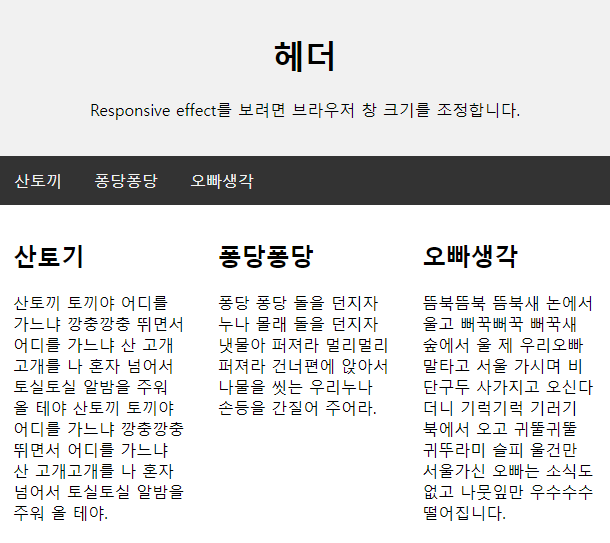
column 클래스는 float left, width 33.33%, padding 15px로 설정하여 div요소가 열 형태로 3개로 분할하여 표시되도록 스타일을 정의하였고, 위의 코드를 실행한 결과는 아래 그림과 같다.
브라우저의 크기를 줄이면 responsive 로 적응하여 아래 그림과 같이 표시된다.

팁: 2열 레이아웃을 만들려면 width 를 50%로 변경합니다. 4열 레이아웃을 만들려면 25% 등을 사용하시오.
팁: @media 규칙이 어떻게 작동하는지 궁금하십니까? CSS 미디어 쿼리 챕터에서 자세히 알아보십시오.
팁: 컬럼 레이아웃을 만드는 보다 현대적인 방법은 CSS Flexbox를 사용하는 것이다. 그러나 Internet Explorer 10 이전 버전에서는 지원되지 않습니다. IE6-10 지원이 필요한 경우 플로트를 사용하십시오(위에서 표시된 것과 같이).
열 너비가 일정치않은 content
주요 content 는 사이트에서 가장 크고 중요한 부분이다.
열 너비가 동일하지 않은 경우가 일반적이므로 대부분의 공간이 주 콘텐츠를 위해 예약된다. 측면 콘텐츠(있는 경우)는 종종 대체 네비게이션으로 사용되거나 주 콘텐츠와 관련된 정보를 지정한다. 원하는 대로 너비를 변경하고 총 100%까지 추가해야 한다:
| <!DOCTYPE html> <html lang="en"> <head> <title>CSS Website Layout</title> <meta charset="utf-8"> <meta name="viewport" content="width=device-width, initial-scale=1"> <style> * { box-sizing: border-box; } body { margin: 0; } /* Style the header */ .header { background-color: #f1f1f1; padding: 20px; text-align: center; } /* Style the top navigation bar */ .topnav { overflow: hidden; background-color: #333; } /* Style the topnav links */ .topnav a { float: left; display: block; color: #f2f2f2; text-align: center; padding: 14px 16px; text-decoration: none; } /* Change color on hover */ .topnav a:hover { background-color: #ddd; color: black; } /* Create three unequal columns that floats next to each other */ .column { float: left; padding: 10px; } /* Left and right column */ .column.side { width: 25%; } /* Middle column */ .column.middle { width: 50%; } /* Clear floats after the columns */ .row::after { content: ""; display: table; clear: both; } /* Responsive layout - makes the three columns stack on top of each other instead of next to each other */ @media screen and (max-width: 600px) { .column.side, .column.middle { width: 100%; } } </style> </head> <body> <div class="header"> <h1>Header</h1> <p>Resize the browser window to see the responsive effect.</p> </div> <div class="topnav"> <a href="#">홈</a> <a href="#">동요의 기원</a> <a href="#">동요를 찾아서</a> </div> <div class="row"> <div class="column side"> <h2>주요주제</h2> <p>동요는 아동의 마음을 밝고 환하게 비취는 역할을 합니다..</p> </div> <div class="column middle"> <h2>동요</h2> <p>산토끼 토끼야 어디를 가느냐 깡충깡충 뛰면서 어디를 가느냐 산 고개고개를 나 혼자 넘어서 토실토실 알밤을 주워 올 테야 산토끼 토끼야 어디를 가느냐 깡충깡충 뛰면서 어디를 가느냐 산 고개고개를 나 혼자 넘어서 토실토실 알밤을 주워 올 테야.</p> <p>퐁당 퐁당 돌을 던지자 누나 몰래 돌을 던지자 냇물아 퍼져라 멀리멀리 퍼져라 건너편에 앉아서 나물을 씻는 우리누나 손등을 간질어 주어라.</p> </div> <div class="column side"> <h2>다른나라 동요</h2> <p>다른 나라의 동요를 확인하려면 여기로..</p> </div> </div> </body> </html> |
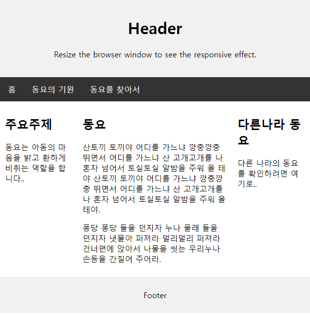
column 클래스(왼쪽 content)는 float left, padding 15px을 정의하였고
column.side 클래스(오른쪽 content)는 width 25%,로
column.middle 클래스(가운데 content)는 width 50%로 정의하였고, 위의 코드를 실행하면 아래 그림과 같다.

Footer
바닥글은 페이지 하단에 있습니다. 여기에는 종종 저작권 및 연락처 정보와 같은 정보가 포함된다:
| <!DOCTYPE html> <html lang="en"> <head> <title>CSS Website Layout</title> <meta charset="utf-8"> <meta name="viewport" content="width=device-width, initial-scale=1"> <style> * { box-sizing: border-box; } body { margin: 0; } /* Style the header */ .header { background-color: #f1f1f1; padding: 20px; text-align: center; } /* Style the top navigation bar */ .topnav { overflow: hidden; background-color: #333; } /* Style the topnav links */ .topnav a { float: left; display: block; color: #f2f2f2; text-align: center; padding: 14px 16px; text-decoration: none; } /* Change color on hover */ .topnav a:hover { background-color: #ddd; color: black; } /* Create three unequal columns that floats next to each other */ .column { float: left; padding: 10px; } /* Left and right column */ .column.side { width: 25%; } /* Middle column */ .column.middle { width: 50%; } /* Clear floats after the columns */ .row::after { content: ""; display: table; clear: both; } /* Responsive layout - makes the three columns stack on top of each other instead of next to each other */ @media screen and (max-width: 600px) { .column.side, .column.middle { width: 100%; } } /* Style the footer */ .footer { background-color: #f1f1f1; padding: 10px; text-align: center; } </style> </head> <body> <div class="header"> <h1>Header</h1> <p>Resize the browser window to see the responsive effect.</p> </div> <div class="topnav"> <a href="#">홈</a> <a href="#">동요의 기원</a> <a href="#">동요를 찾아서</a> </div> <div class="row"> <div class="column side"> <h2>주요주제</h2> <p>동요는 아동의 마음을 밝고 환하게 비취는 역할을 합니다..</p> </div> <div class="column middle"> <h2>동요</h2> <p>산토끼 토끼야 어디를 가느냐 깡충깡충 뛰면서 어디를 가느냐 산 고개고개를 나 혼자 넘어서 토실토실 알밤을 주워 올 테야 산토끼 토끼야 어디를 가느냐 깡충깡충 뛰면서 어디를 가느냐 산 고개고개를 나 혼자 넘어서 토실토실 알밤을 주워 올 테야.</p> <p>퐁당 퐁당 돌을 던지자 누나 몰래 돌을 던지자 냇물아 퍼져라 멀리멀리 퍼져라 건너편에 앉아서 나물을 씻는 우리누나 손등을 간질어 주어라.</p> </div> <div class="column side"> <h2>다른나라 동요</h2> <p>다른 나라의 동요를 확인하려면 여기로..</p> </div> </div> <div class="footer"> <p>Footer</p> </div> </body> </html> |
footer 클래스는 background-color #f1f1f1, padding 10px, text-align center로 스타일을 정의하였고, 위의 코드를 실행한 결과는 아래 그림과 같다.
Responsive 웹사이트 레이아웃
| <!DOCTYPE html> <html> <head> <style> * { box-sizing: border-box; } body { font-family: Arial; padding: 10px; background: #f1f1f1; } /* Header/Blog Title */ .header { padding: 30px; text-align: center; background: white; } .header h1 { font-size: 50px; } /* Style the top navigation bar */ .topnav { overflow: hidden; background-color: #333; } /* Style the topnav links */ .topnav a { float: left; display: block; color: #f2f2f2; text-align: center; padding: 14px 16px; text-decoration: none; } /* Change color on hover */ .topnav a:hover { background-color: #ddd; color: black; } /* Create two unequal columns that floats next to each other */ /* Left column */ .leftcolumn { float: left; width: 75%; } /* Right column */ .rightcolumn { float: left; width: 25%; background-color: #f1f1f1; padding-left: 20px; } /* Fake image */ .fakeimg { background-color: #aaa; width: 100%; padding: 20px; } /* Add a card effect for articles */ .card { background-color: white; padding: 20px; margin-top: 20px; } /* Clear floats after the columns */ .row::after { content: ""; display: table; clear: both; } /* Footer */ .footer { padding: 20px; text-align: center; background: #ddd; margin-top: 20px; } /* Responsive layout - when the screen is less than 800px wide, make the two columns stack on top of each other instead of next to each other */ @media screen and (max-width: 800px) { .leftcolumn, .rightcolumn { width: 100%; padding: 0; } } /* Responsive layout - when the screen is less than 400px wide, make the navigation links stack on top of each other instead of next to each other */ @media screen and (max-width: 400px) { .topnav a { float: none; width: 100%; } } </style> </head> <body> <div class="header"> <h1>나의 웹사이트</h1> <p>브라우저 창 크기를 조정하여 효과를 확인합니다.</p> </div> <div class="topnav"> <a href="#">홈</a> <a href="#">동요의 기원</a> <a href="#">동요 노래</a> <a href="#" style="float:right">연락처</a> </div> <div class="row"> <div class="leftcolumn"> <div class="card"> <h2>동요의 기원</h2> <h5>작성일자, Dec 7, 2023</h5> <div class="fakeimg" style="height:200px;">Image</div> <p>1920년 이전의 동요를 대개 전래동요라고 부르며, 그 이후에는 어른이 만든 창작동요나 외국의 동요를 번안한 곡들이 주를 이룬다. 현대에 와서는 어린이 만화영화나 TV 프로그램(가령, 뽀뽀뽀)의 주제가도 동요로서 같이 취급되기도 한다.</p> </div> <div class="card"> <h2>동요 노래</h2> <h5>작성일, Sep 2, 2023</h5> <div class="fakeimg" style="height:200px;">Image</div> <p>--------------------------</p> <p>산토끼 토끼야 어디를 가느냐 깡충깡충 뛰면서 어디를 가느냐 산 고개고개를 나 혼자 넘어서 토실토실 알밤을 주워 올 테야 산토끼 토끼야 어디를 가느냐 깡충깡충 뛰면서 어디를 가느냐 산 고개고개를 나 혼자 넘어서 토실토실 알밤을 주워 올 테야.</p> </div> </div> <div class="rightcolumn"> <div class="card"> <h2>About Me</h2> <div class="fakeimg" style="height:100px;">Image</div> <p>우리는 동요를 사랑하는 모임입니다. 모두 참여해주세요..</p> </div> <div class="card"> <h3>Popular Post</h3> <div class="fakeimg"><p>Image</p></div> <div class="fakeimg"><p>Image</p></div> <div class="fakeimg"><p>Image</p></div> </div> <div class="card"> <h3>Follow Me</h3> <p>Some text..</p> </div> </div> </div> <div class="footer"> <h2>Footer</h2> </div> </body> </html> |
responsive 실행 결과 화면

브라우저 창 크기를 줄이면 아래 그림과 같이 표시된다.

지금까지 CSS 웹사이트 레이아웃에 대한 개념과 다양한 레이아웃에 대해 실습을 해보았다.
모두 손으로 눈으로 머리로 익히며 실습하기를 바란다.
모두 화이팅입니다.!!!
출처 : 이 글의 출처는 w3schools사이트를 참고하였으며 필자가 추가하여 정리한 글입니다.
'HTML > CSS문법' 카테고리의 다른 글
| CSS Units (0) | 2023.09.11 |
|---|---|
| CSS Counter (0) | 2023.09.10 |
| CSS textarea, select menu, input button etc (0) | 2023.09.08 |
| CSS Form - input (0) | 2023.09.07 |
| CSS Attribute Selector(속성 선택자) (0) | 2023.09.06 |


댓글